iOS 11 introduces a new Dock. It is conceptually related to the Mac Dock introduced in OS X, and is surprisingly similar. In fact, the biggest difference may be that so far people seem to love the new iOS 11 Dock, whereas there are still beardos who hate the Mac Dock.
Like its Mac counterpart, the iOS 11 Dock packs in a surprising number of features. Lets take a look at them.
Activating the iOS 11 Dock
The Dock is essentially an app launcher, with a few special powers that differentiate it from the other app launchers on iOS, like the Home screen or the ⌘-Tab app switcher. Like the Docks in iOS 10 and earlier, it stays put when you swipe between home screens, only now it can also be summoned when you're inside an app, by simply swiping up from the bottom of the screen.
This gesture was previously reserved for activating the Command Center, and if you keep on swiping up, the Command Center will still appear (as part of a new "Mission Control" app switcher screen).
Another way to activate the Dock while in an app is to hit a new keyboard shortcut on a connected hardware keyboard: ⌘⌥D. This toggles the Dock, sliding it in and out of the bottom of the screen. This lets you quickly check for any notifications, or just access your apps so you can launch one. You can also, like on the Mac, drag a file onto an app in the Dock, or use a special new medium-long tapto pop open a list of an app's most-recently-accessed files.
Recently-used apps

Photo: Cult of Mac
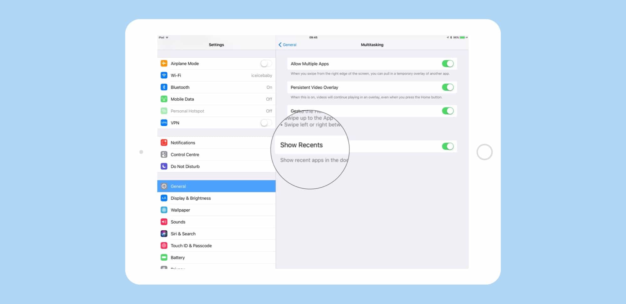
In iOS 11, the Dock is split into two parts. On the left — the largest part — are all the apps you have put there yourself. This is just like the old pre-iOS 11 Docks. Over on the right is a new section of three apps, which are chosen by Siri. These are most likely the apps you have used most recently, but not always. For instance, I use an app to control a guitar effects pedal over Bluetooth, and whenever that app is connected, Siri keeps it at the far right of the Dock, even when I haven't opened it for a while. You can toggle this section on and off in the Settings app, under Settings>General>Multitasking>Show Recents.
Drag-and-drop Dock
The Dock is nice as a plain launcher, but it can also be used with iOS 11's new drag-and-drop features. Perhaps the most important use is as a source for split-view apps. If you're in, say, Safari, you can swipe up to show the Dock, then drag out an app and drop it onto either side of the main screen. It will open in Slide Over view, as a floating window. To turn this into a full Split-View app, just tap the little drag-line at the top of the window.
If you are already in Split View, then dragging an app into either pane will replace that pane with the newly-dragged app.
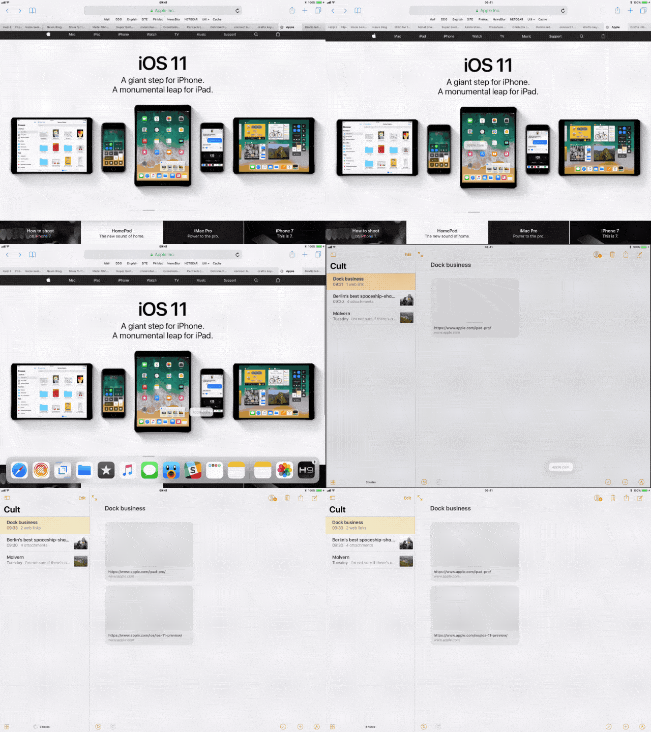
That's dragging things out of the Dock, but you can also drag things into the Dock. If you're running the beta, try this: In Safari, drag a link down toward the bottom of the screen, and then activate the Dock (you can use a keyboard if you have one connected, but I find the easiest way is to flick up from the bottom of the screen with the thumb of the hand I'm using to drag the link — this really is an easy one-handed operation).
Then, drag that link over an app in the Dock — Mail, Drafts, Notes, anything capable of receiving a link. Hover over the app icon for a moment, then the app icon will flicker and the app will launch. It's the exact-same way it works on macOS. Now, you can keep dragging the link to the place you want to use it, and drop. That explanation makes it seem more complicated than it is, so here's a GIF showing the process:
Dock extras
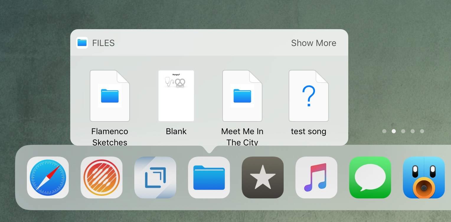
In the iOS 11 beta, there is one mystery feature that is far from fully-baked, but looks like it could be a killer time-saver. It's a popover which appears when you do a longish tap on an app that supports files — Files app, several music apps, Readdle's apps, and others — and shows you recently-accessed files. You can tap one of these files to open it, but you can also drag a file right out of that popover to open in another app, or send it by mail, iMessage, etc. This is fantastic, because you don't need to actually open an app to get to its files.

Photo: Cult of Mac
In fact, this may be one of the neatest parts of iOS 11's new focus on files, conceptually speaking. It gives you the flexibility to arrange and access your files like you would on a Mac, but still ties those files to the app that created them. Most iOS users are now accustomed to finding their files inside an app. This popover, available in both the Dock and on the home screen, combines both of these, letting you get your files from an app, but use them elsewhere. It's subtle but brilliant.
Arranging the Dock
To get apps into the Dock, you just press an app until it jiggles, and move it into the the Dock. Nothing has changed there. You can also put a folder of apps into the Dock. You could always do this in previous iOSs too, but there was little point. In iOS 11, though, a folder in the Dock is a great idea. Because the only sane way to grab an app to use in Split View is from the Dock, any apps that aren't there are a pain to find. So, you can make a folder of apps that you don't need taking up permanent space in the Dock, but that you use often enough to need quick access to, and drop it in the Dock. Bonus tip: Dragging a file over a folder opens that folder, so you can keep drilling down to the app you want.
The new iOS 11 Dock is one of its nicest features. It ties together the old and the new, and is at once familiar and surprising. Familiar, because it's the same Dock we've had on the Mac for years, and surprising, because it brings so many Mac-like features along with it.
There's lots of room for growth, too. For instance, the Settings app could pop over a list of popular settings when long-pressed, and apps like Slack could offer up a list of recent chats, or recent alerts. The possibilities are many, but even in its current beta state, the new iOS 11 Dock rocks.
Posted by: Alice Saunders <lwr32@mac.com>
| Reply via web post | • | Reply to sender | • | Reply to group | • | Start a New Topic | • | Messages in this topic (1) |

